
Command Palette
Search for a command to run...
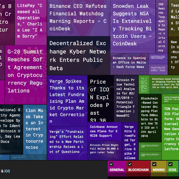
Crypto News Heatmap
Visually see the entire crypto news landscape in one glance
last checked Aug 24, 2026 · HTTP 403
CohortClass of 2018What it is
Visually see the entire crypto news landscape in one glance. — With this crypto heat map, you can visually see all that is happening in the crypto ecosystem in just one place. Colours represent category, size represents importance and darkness represents age. Categories in the bottom can be clickable and you can hover across an article to see more info. Looks really cool on a flat screen tv! [News, Web3]
HTTP liveness
23 probes since Jun 11Jun 11Aug 24
AliveHard-dead (404/5xx/parked)RedirectedUnverified (timeout/DNS/block)
Observed events
probes · press · GitHub- Jun 11, 2026First probe — unverifiedTimeout
Discussion 0 comments
No comments yet. Be the first!
Pulse Indexobserved activity
82/4 signal families
Liveness40%0.20
Press30%no data
GitHub20%no data
Tranco10%0.03
Weighted observed activity · updated Aug 26
Cohort survival · Class of 2018weekly
2,435 products launched in 2018 · 100% still active
2,425 active10 sunset
Still active
100%
Median lifespan
4.9y